Sunday 12 October 2014

Wedding Fayre

Recently, the team at Pure Grace decided to do a wedding fayre – something none of us had done before and slightly scary.

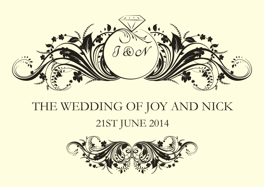
I had a couple of photo albums with invitation samples in, but wanted something more eye-catching. I decided to design a ‘Save the Date’ to match some of the invitations and display them together in a large picture frame. This was to prove pretty successful and definitely an eye-catcher.

The day came and we got to the venue, Hartford Golf Club, early. We were shown which was our table and we set too in dressing it in the best way we could, to show off our services.


With a bit of a nervous start we introduced ourselves to anyone who stopped at our table. We originally thought that we needed to be careful not to overwhelm anyone; with they’re being four of us. It soon became clear that four of us were not enough. We were happily kept busy with the amount of interest in our services.


As we all relaxed a bit, we started to very much enjoy chatting and laughing with future Bride and Grooms. Finding out what they’re plans are and how our services could be of help. Everyone that stopped by was lovely and very complimentary about my stationery.


I would like to say a BIG thank you to you all for making it a wonderful day.

And another BIG thank you to those of you who have already expressed an interest in having a further meeting. I very much look forward to meeting you again.


Gill xx

Thursday 7 August 2014

Sarah

This is one of my favourite designs. It's simple, elegant, yet contemporary.

I like the way that the pattern border can be used in a positive and a reversed way. A classic text style has been used to give an overall simple elegance.

The design can be incorporated into a variety of invitation styles, and the colour can easily be changed to suit any chosen colour scheme.

Here, I have used a white hammered effect card and designed a flat style and folding style invitation, with paper insert. A place card and RSVP card has also been produced to show the versatility of this pattern.


Beth

The Beth invitation has been designed with an intricate heart motif, incorporating the initials of the happy couple combined together using an enlarged ampersand in the background. The text style has been chosen to compliment the motif and give an overall elegance.

This pocket style invitation has also been designed so that the motif on the insert is not obscured by the pocket front, before it is removed. The ivory card used, is a mixture of plain and linen effect.

The ribbon bow embellishment can be changed to suit any colour scheme, and gives an additional personal touch to the invitation.


Caitlyn

If classic, simple elegance is your style, then you can't go wrong with the Caitlyn design.

This is a pocket style invitation, using plain and linen effect ivory card.

The ribbon and embellishment can be changed to suit any colour scheme or style. The script text adds to the elegance of the occasion, and the small pearl decoration on the insert helps to pull the insert from it's pocket.

I'm sure your guests would be very impressed to receive an invitation like this.


Kirsty

Here is an invitation design for fans of vintage or shabby chic.

It's a pocket style invitation, which can hold not only the invitation itself, but you could add any additional details or RSVP cards etc in the pocket.

The design is printed on white linen effect card and mounted onto plain white card to compliment the texture.

The colour scheme can be changed to suit, sky blue or mint green instead of pink could be just as fun and gives that summer fayre or grand picnic feeling.


Rachel

The Rachel invitation has been designed using a motif and font to give a Victorian feel. This would compliment greatly with any Victorian style venue.

The invite is a classic folding style card with a paper insert. Both linen effect and plain ivory card has been used.

The addition of the ivory ribbon and pearl completes the finished look.


Saturday 5 July 2014

Joy and Nick 21st June 2014

Joy & Nick asked me if I would do their stationery, after being guests at Emma & Leigh's wedding. They had already purchased day invitations from an internet company and wondered if I could do the evening ones to match as well as everything else they needed for the wedding day itself. I was delighted.

Once the evening invitations were designed and completed, the rest of the stationery followed.


They felt that an order of service was not really required, but loved the idea of a welcome card, with an order of the day, on the reverse.


The tables at the wedding breakfast were being named after the local pubs that they visited since they met each other. This gave me the idea to create an old fashioned style pub sign for the individual tables and the table plan.

The table plan was framed in a large picture frame and displayed on an easel at the venue.


 On each of the tables were two copies of the menu for the guests to read.


Joy also asked for a small folder of some sort, that could hold a card on which she could write a special message for each guest. I designed a folder for this purpose but then also added a tag with the J & N logo and another tag for the guest's name, so that this could, also, be used as the individual place names around the tables. I dropped off a sample of this, to see if Joy liked it. She loved it. Which pleased me immensely.


Joy & Nick had a fantastic day (and evening) celebrating their marriage. I was lucky enough to have an evening invitation and when I turned up they both gave me a big hug and couldn't thank me enough for the 'beautiful stationery' I had done for them. It might have been a bit of the wine talking, but it made me extreamly proud of the small part I played in their big day.