Showing posts with label elegant. Show all posts

Thursday, 7 August 2014

Sarah

This is one of my favourite designs. It's simple, elegant, yet contemporary.

I like the way that the pattern border can be used in a positive and a reversed way. A classic text style has been used to give an overall simple elegance.

The design can be incorporated into a variety of invitation styles, and the colour can easily be changed to suit any chosen colour scheme.

Here, I have used a white hammered effect card and designed a flat style and folding style invitation, with paper insert. A place card and RSVP card has also been produced to show the versatility of this pattern.


Beth

The Beth invitation has been designed with an intricate heart motif, incorporating the initials of the happy couple combined together using an enlarged ampersand in the background. The text style has been chosen to compliment the motif and give an overall elegance.

This pocket style invitation has also been designed so that the motif on the insert is not obscured by the pocket front, before it is removed. The ivory card used, is a mixture of plain and linen effect.

The ribbon bow embellishment can be changed to suit any colour scheme, and gives an additional personal touch to the invitation.


Caitlyn

If classic, simple elegance is your style, then you can't go wrong with the Caitlyn design.

This is a pocket style invitation, using plain and linen effect ivory card.

The ribbon and embellishment can be changed to suit any colour scheme or style. The script text adds to the elegance of the occasion, and the small pearl decoration on the insert helps to pull the insert from it's pocket.

I'm sure your guests would be very impressed to receive an invitation like this.


Rachel

The Rachel invitation has been designed using a motif and font to give a Victorian feel. This would compliment greatly with any Victorian style venue.

The invite is a classic folding style card with a paper insert. Both linen effect and plain ivory card has been used.

The addition of the ivory ribbon and pearl completes the finished look.


Saturday, 5 July 2014

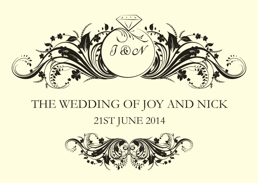
Joy and Nick 21st June 2014

Joy & Nick asked me if I would do their stationery, after being guests at Emma & Leigh's wedding. They had already purchased day invitations from an internet company and wondered if I could do the evening ones to match as well as everything else they needed for the wedding day itself. I was delighted.

Once the evening invitations were designed and completed, the rest of the stationery followed.


They felt that an order of service was not really required, but loved the idea of a welcome card, with an order of the day, on the reverse.


The tables at the wedding breakfast were being named after the local pubs that they visited since they met each other. This gave me the idea to create an old fashioned style pub sign for the individual tables and the table plan.

The table plan was framed in a large picture frame and displayed on an easel at the venue.


 On each of the tables were two copies of the menu for the guests to read.


Joy also asked for a small folder of some sort, that could hold a card on which she could write a special message for each guest. I designed a folder for this purpose but then also added a tag with the J & N logo and another tag for the guest's name, so that this could, also, be used as the individual place names around the tables. I dropped off a sample of this, to see if Joy liked it. She loved it. Which pleased me immensely.


Joy & Nick had a fantastic day (and evening) celebrating their marriage. I was lucky enough to have an evening invitation and when I turned up they both gave me a big hug and couldn't thank me enough for the 'beautiful stationery' I had done for them. It might have been a bit of the wine talking, but it made me extreamly proud of the small part I played in their big day.


Friday, 9 May 2014

Emily

Featuring a border of foliage, the Emily design has a contemporary yet slightly art nouveau feel to it. The type style here compliments well with the border design.

The invitation is a single piece of hammered effect, white card that has been printed on both sides.


Thursday, 8 May 2014

Nicola

With the addition of satin ribbon and an embellishment cluster, this simple design is transformed into a very classically elegant invitation.

The script writing for the bride and groom's names has been altered so that they are combined together using the ampersand.

The card itself has been created using plain white card with the venue details printed on the reverse and linen effect white card layered to form the elegant front.

The colour of the satin ribbon and bow can easily be changed to suit any wedding day colour scheme.


Helen

Printed on folded, linen effect, ivory card, this design incorporates a Victorian style flock pattern and traditional serif text.
The text is kept to a minimum on the front of the card, with the rest of the information printed onto a paper insert.
The overall feel to this invitation is one of traditional sophistication and simple elegance.


Mandy

This is a design based on using a mix of traditional script and serif writing but with a contemporary twist by adding the bride and groom's initials to the background.

The initials and any outer border can match the colour scheme of the day, giving a very personal feel to the stationery.


This invitation is printed onto a single layer of white, hammered effect, card.


Saturday, 19 April 2014

Charlotte

The Charlotte invitation, is a simple but classically elegant design.

The text and calligraphic swirl is given plenty of space and bordered top and bottom with two tones of a contrasting colour. This colour can be matched to the chosen wedding theme.

The reverse side of the invitation will have all the other details a guest requires, regarding the venues and times etc.


Sunday, 6 April 2014

Emma and Leigh 28th February 2014

Emma had an idea of what she wanted for her wedding day stationery. The overall colour scheme was to be ivory and black. She had browsed the internet for ideas and had already purchased a bunting type banner to display on the front of the sweets table. This had script style text and a black butterfly decoration. She had also seen butterfly place names that sit on your wine glass, and particularly wanted something on these lines.

With this information, I went away and designed some ceremony seating cards. This would give an initial idea of a motif and script text that we could use throughout the rest of the stationery.

She loved it.

As well as ceremony seating cards, Emma wanted something to give her guests an idea of what will happen and when throughout the day. This was a civil ceremony, taking place at the venue where the wedding reception and evening celebration was being held, so an 'order of service' didn't really fit the bill. I then came up with the idea of a welcome card. A postcard size card with a front and back. Something for the guests to read as they take their seat ready for the ceremony.


These worked well, and the guests liked them, not only for their information, but for their size as a lovely keepsake of the day.

Next we worked on how to present the tables for the wedding breakfast. Emma had decided to use numbers for each table but wanted them to be incorporated with a fact about the happy couple.

We also needed a table plan, so that the guests knew which table to sit at. Again, Emma wanted something a bit different to the norm. We finally hit on the idea of using one of those multi-framed photo display picture frames, that you would hang on the wall to display several photos at once. Instead of photos in each frame, we put the table number and the names.

We were both very pleased at how this looked and displayed.

For each table we put a copy of the menu for the guests to see.

This was a folded A4 card which opened up to display the full menu using the whole of the A4 size inside.

For each place setting, I designed a butterfly shape that could be cut by hand using scissors, (as I do not own a die-cutting machine, yet!) and added some graphics as well as the name.

A small nik is made in the body of the butterfly so that it can be lodged onto a wine glass.

As well as some black butterfly table confetti, the only other extra, that I designed, was a folder to hold a lottery scratch card. These were the favours for each guest, and can be seen under the napkin in the photo below.


The whole room looked amazing.
Being a guest at the wedding, I had a fantastic day and it was lovely to receive such wonderful compliments on the stationery that I had done.
It gave me immense satisfaction and it felt such a privilege to have been involved in someones special day doing something that I love.